

 The toolbar buttons shown at right are for adjusting colours.
They represent: a pipette (eye-dropper) for picking up colours, a paint bucket,
for pouring colours, a colour selector dialogue with sliders, and a standard
Java colour selector.
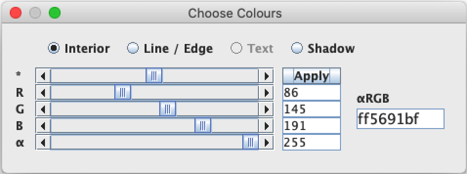 Nefertari has two colour selector dialogues. With the first, you can change the
interior colour of a shape, the colour of its edge, the colour of its shadow,
the colour of text (if the shape has text), and the colour of the canvas.
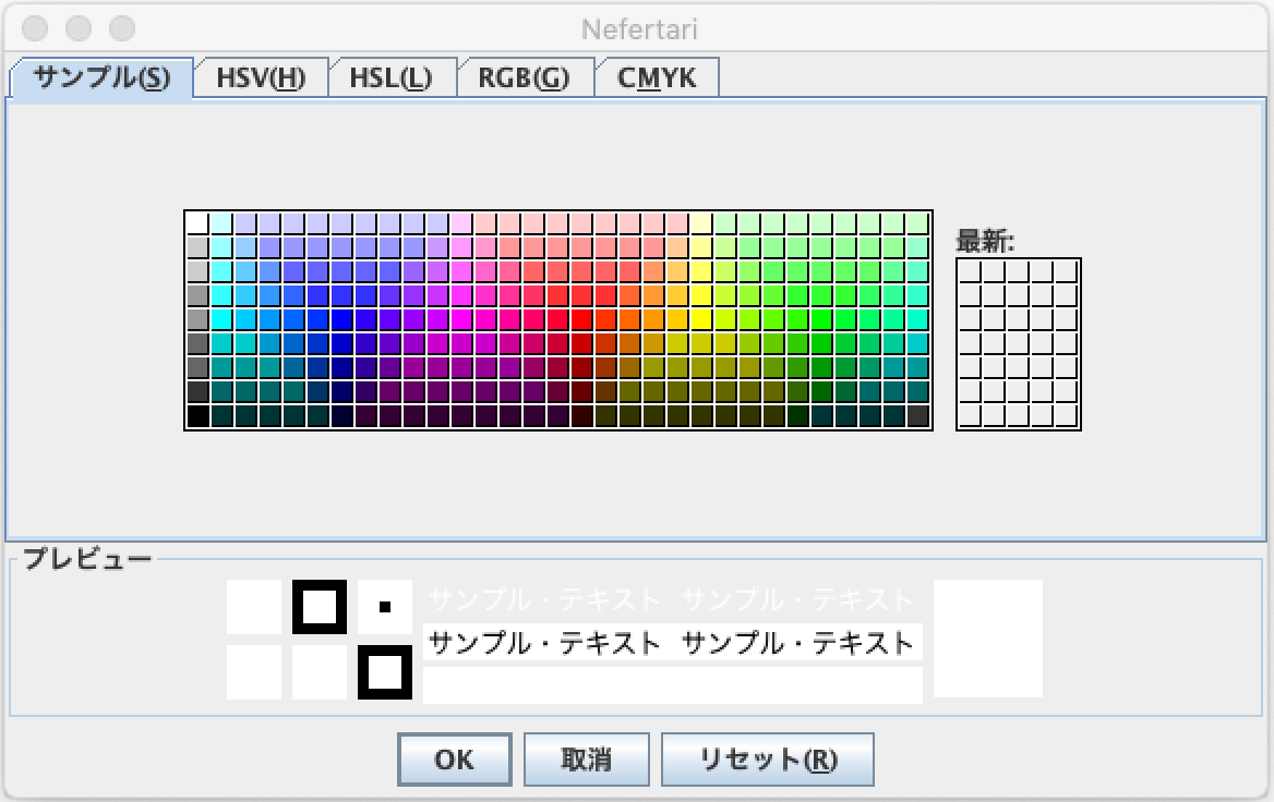
The second colour selector is the standard Java colour selector.
It has more options, but it can only change the interior colour
of a shape, or the colour of the canvas.
I will describe the first colour selector below.
Open the first selector dialogue and select the shape you wish to change by clicking on it. This dialogue has sliders for Red, Green, and Blue (R, G, B). Adjust these sliders to set the desired colour.

To change the background colour, simply click on the background and adjust the sliders.
The minimum value of a slider (on the left) is 0, and the maximum value (on the right) is 255. These values are displayed in text fields to the right of each slider.
Instead of adjusting the sliders, you can type values (between 0 and 255) in the text fields, and click on Apply, or just type <Enter> on your keyboard. The colour of your shape will be updated.
The top slider, marked by an asterisk (*), moves the red, green and blue sliders together.
The bottom slider (α), adjusts the transparency (alpha-value) of the shape. A value of 0 corresponds to complete transparency; a value of 255 makes the shape completely opaque.
On the right side of the colour dialogue is a field labelled αRGB. This field contains the hexadecimal representation of the current colour. There are two hexadecimal digits for each value, eight in total.
If you type a value in this hexadecimal field and type <Enter>, the colour of your shape, and the other controls, will be updated.
To change the colour of a shape's edge, or the colour of text, click on the shape and select a checkbox at the top of the colour selector dialogue, as shown below.

 The colour selector described above can also adjust the colour of shadows,
if the selected shape has a shadow. To make a shadow, click on the shadow
toolbar button, shown at right. The Shadow Properties dialogue will appear.
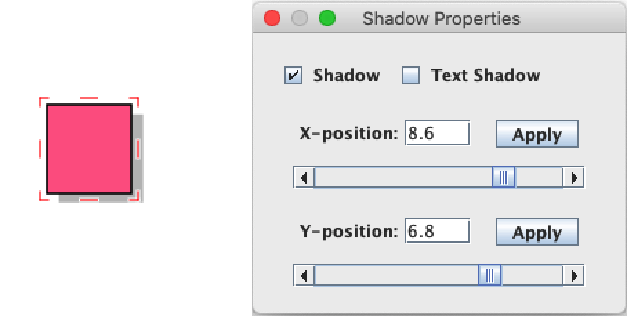
Click on the Shadow checkbox to give the shape a shadow. By default, the colour is gray, but you can change this with the colour selector.
The Shadow Properties dialogue has sliders to adjust the relative position of the shadow. You can use these, or type a value into a text field and click on Apply.
Text can also have a shadow, as the screenshot below shows. Select your text-shape, and click on the Text Shadow checkbox.

 The pipette (eye-dropper) and paint bucket are used together. The pipette picks
a colour off the drawing, and the bucket fills in a shape, or paints the canvas.
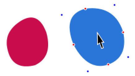
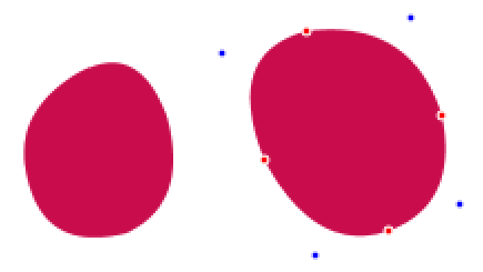
Consider the red and blue shapes below. Suppose that you want both of them to have the same colour, red. First, click on the interior of the red shape, to select the colour. Next click on the pipette. The pipette will pick up the red. Next select the blue shape, and finally click on the bucket button. The blue shape will become red.
 |
 |
 |
 |
 |
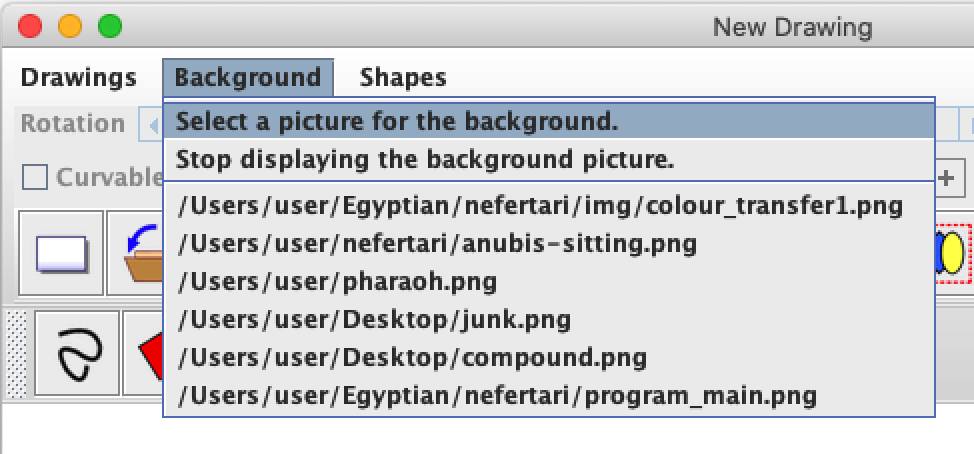 The pipette can also pick up colours from an image. First, load a
background image, using the Background menu.
The menu item 'Select a picture for the background' will open a file dialog. Select an image file (png, jpg, bmp or gif format) and click on Open.
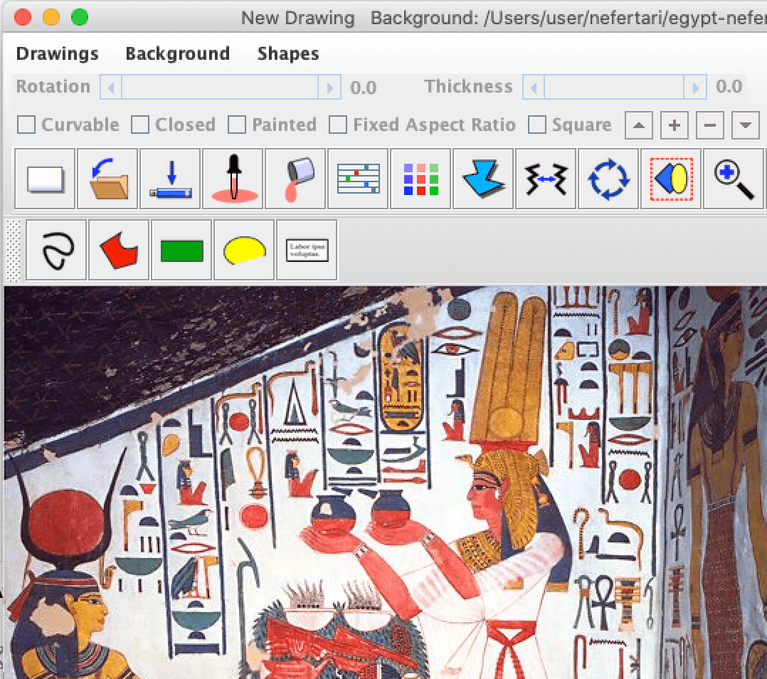
Click on the canvas to select a colour, then click on the pipette to pick it. In the screenshot above, the pipette was use to pick up Nefertari's skin tone.